No End In Sight....!
I Have been stitching a Lot, Dear Readers, as I find it a soothing activity in these Troubled Times. In the above picture you can see the cushions I have been stitching, and the Unicorn cushion has had the dark red outlining completed. It really makes the image clear, and reveals the places where the design just might have a few problems... like around the beast's tail and the fence... but no matter, those cannot be corrected at this stage of the work! And you can also see the incomplete Wyvern cushion, waiting for new colors of silk threads to arrive... some are on back-order and have a long travel to get here. As you might imagine, it did not take me long to add the red background to the Unicorn cushion. But having made so many in this series, I was neglecting to take progress photos.

Here you can see the Unicorn cushion is nearly complete... only one corner still needing the bright red! Of course, I finished it and neglected to get a good finished photo... because I'm stitching a lot! And the next cushion design (those two spaces need to be cushions...!) was probably going to be another of Candace Bahouth's designs... but I hadn't decided which... and did I have the right threads? Still to be determined. Which left me with a couple of my other not-yet-finished stitching projects, either the Chinese Dragon carpet or the Medieval Cluny Merchant Tapestry.... neither of which had been worked on in months.

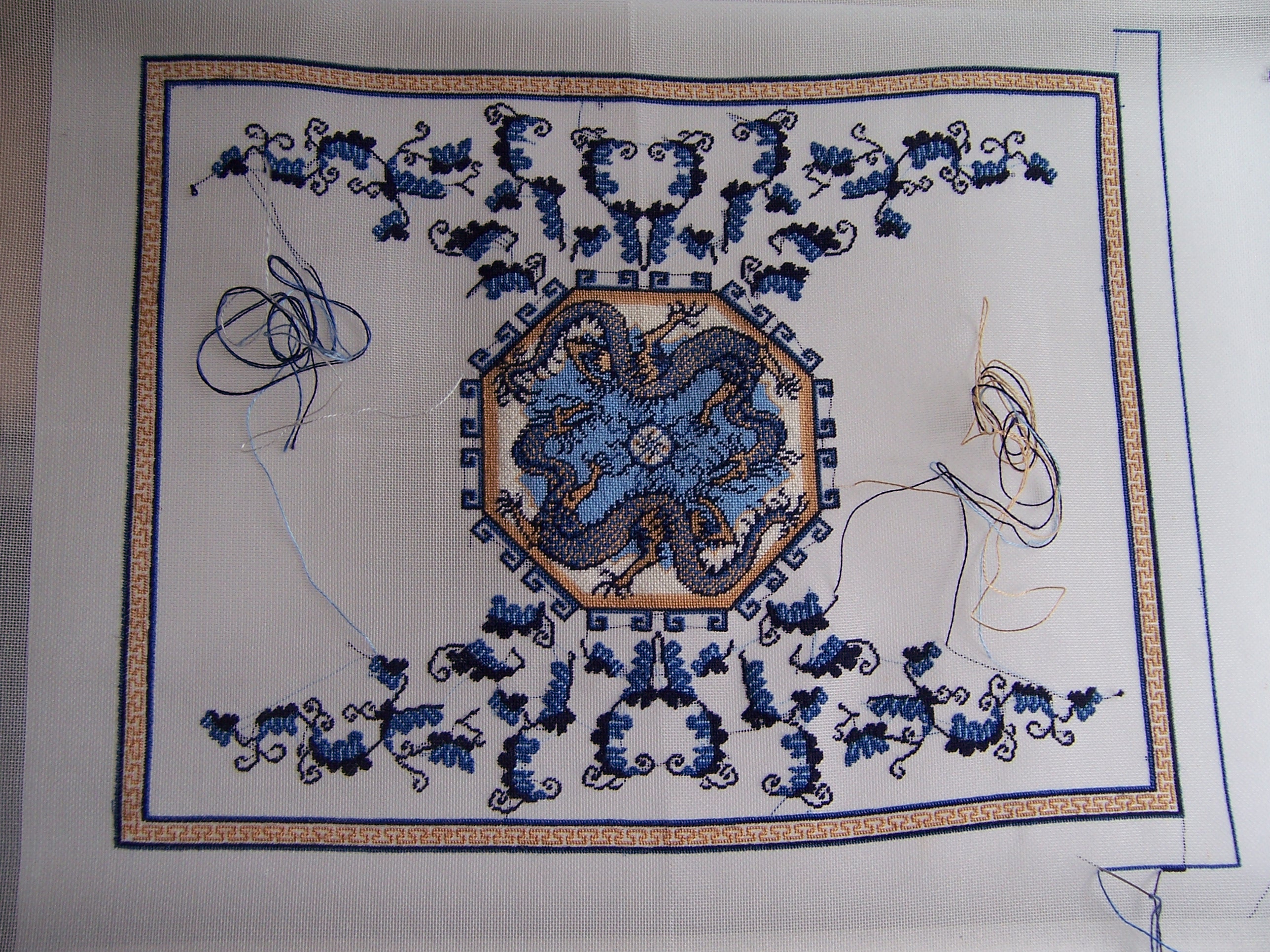
You might recall that I was trying to decide which color thread to use in the "golden" border of the Chinese Dragon Carpet in order for the lovely Greek Key pattern to show. The thread included in the kit was so similar in hue that the design was not apparent. I had done several test samples, without being able to decide which would suit the overall design the best... you can see them here along the edge...
And then I realized that in order to really see what they would look like, I had to include the dark blue outlines too. On the one with the navy blue ground it just tones the contrast down a bit, while on the one with the darker blue ground, it visually widens the band and makes the dark blue more powerful. This looks great in isolation... but would create a very strong dark rather than gold feeling to the border! Hmmmm.... still not clear! But the one thing that is clear... is that if I keep stitching the gold... I make progress!
(Sorry the picture is dark... we are having a lot of dark rainy days again...)
Look at all that progress!
It felt like I would never be done with that pattern...
but the gold is done!
And there is plenty of stitching to be done before
I have to know the color for the background of this border.
But do you even remember the Cluny Merchant tapestry, Dear Readers?
(I will be calling him a Lord, not a Merchant...!)
This is one of Janet Granger's kits for Medieval style Tapestry.
(She has retired and closed her shop)
But I was never happy with the costume for this fellow.
It was way too Tudor Era and not Medieval enough for me.
I had already stitched two of her tapestries, the Medieval Ladies,
and had radically altered one of them.
It was time to tackle this fellow's costume problems!
Here you can see the original chart
and what I had stitched already that I was not going to change.
(After I had un-stitched what I could!)
The position of the hand and the drape of the sleeve
needed to be a little different.
And his under-tunic would not be visible at the neck.
The collar would be wide and closed.
The era I am using is more 1430 than 1500...
The belt is very low on the waist and the tunic very pleated
and the sleeves and hat are emphasized and outlandish...
I needed to actually chart the new design....
Gradually adding the details... coloring in the squares....
And beginning to stitch the changes... the new hand position....
Adding the fur to the collar....
And beginning the hat.... and needing to alter the colors somewhat!
The original greens provided for the kit were too similar in the darker tones...
I swapped the mid range one for a more olive green...
and the lighter one for a more apple green.
And started the sleeves...
Adding more fur on the sleeves....
And adding the belt and purse and starting the tunic pleats....
And here you can see him placed next to the
Medieval Ladies Tapestry I stitched a few years ago.
I have been "assuming" from the start that these tapestries are all
fragments of a much larger original tapestry.
The Lord's section is taller than the Ladies one,
but it will not matter because they will not be in the same room...
you will never see them side by side.
And in the Medieval era they did not change the size
of the figures for proportional reasons,
but more for the importance of the figure itself.
Here I have finished the fur at the hem of his tunic
and am working slowly on the pleats.
There is still a long way to go,
and eventually I will get his horse charted too...
but first I have to decide the colors for him...
Meanwhile, some of the threads I ordered for the Wyvern arrived...
Here I am adding the dark blue to the sky.
The charts for this are not easy to read...
some of the printed colors are very similar in hue and hard to tell apart.
Also the colors on the chart are not all close to the real stitched colors.
When in doubt, I have been relying on the photo of the finished project in the book...
and that one shows the sky as dark.
Here you can see I have begun to add the mid-range blue to the sky...
and I also stitched much of the bright coral color of the body.
The "fire" he is breathing is gold metallic thread.
It was very challenging to stitch but it makes a great impact!
Oh, and you can see the completed Unicorn too!
So you can see, Dear Readers,
I have been stitching a Lot...
And there is Still no end in Sight!