
Blue... Gold.... Green...
As You might be aware, Dear Readers, I have been wrestling a lot recently with Color choices for my many various stitching projects. This is in great part due to my tendency to change the designs that were the original kit specifications, but also due to the change of thread type being used due to the changed scale of the project. The threads specified for the Wyvern (and the future Lion) cushion, are all intended for DMC cotton pearl thread and the projects were scaled for RL products. When I noticed that the number of stitches for the Wyvern design was exactly the same as that for the Milles Fleures Kits I had been stitching, I assumed I could just use the same Milles Fleures kit silk threads for the Wyvern. And I could for the most part, but there were not enough colors in the Milles Fleures selection to match all the colors in the Wyvern design. So I set about ordering the missing thread colors... but this is very challenging when you don't have a chart to compare the colors across different manufacturers. And the availability of the silk threads here in the USA is hindered by the fact that they are imported so not all stores carry all or any of them. And trusting to the pictures of on-line ordering is also risky... they even don't recommend using the colors shown as a guide! You need to know the number of the color you want... which I have no clue about! So I have been ordering anyway... a kind of thread roulette... I assume I will eventually use the silk even if not right away on this project. For the Wyvern, I got lucky and could use two of the darker blues I ordered for the sky. You can see I have finished stitching that part in the above photo. I am still waiting for a blue-green thread, a purple thread, and could not use the only orange-ish color I ordered as it was too dark for the highlights on the Wyvern's scales. So meanwhile, I have started stitching the frame for the Lion cushion...


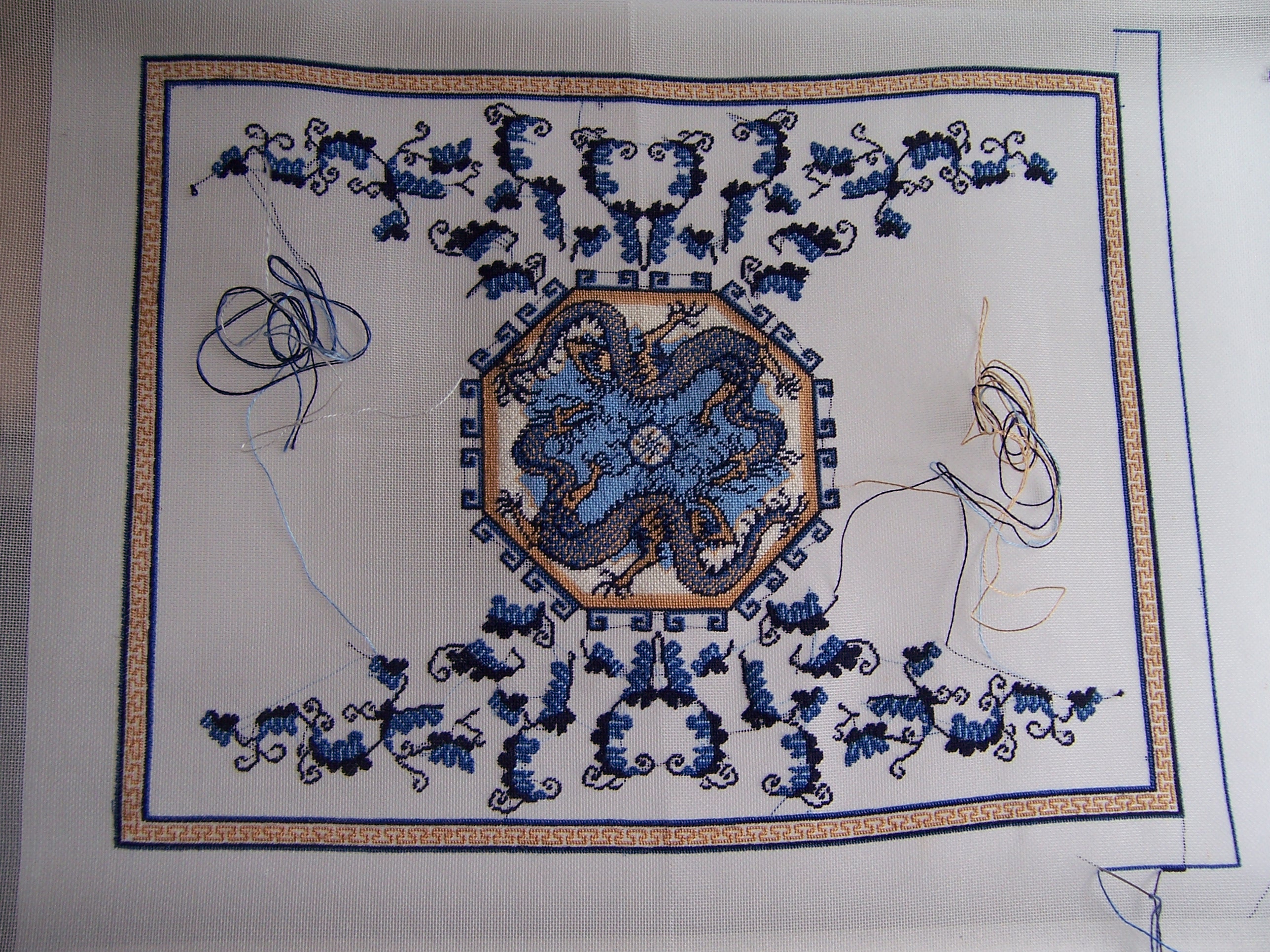

I had shown sample of the options I tried so far... a paler gold background.... (bottom) the kit threads as specified (next above) the cream background (third from bottom) the dark blue (fourth up) and the navy blue (top option). And by then I had realized I really needed to include the dark blue outlines for this band in order to get the real effect. I had not intended to try the pale sky blue that is the background of sky with the dragons in the center.....(a piece of the design added by me) because I was pretty sure it would not work at all. But when a Dear Reader suggested I could try it, I thought that this would be a great example to use to show how some colors just do not play nicely with each other! Rather than just try to describe why... they are too similar to each other in intensity (or tone, both being mid-range) and too dissimilar in hue (they just cancel each other out!)..... I should show why by stitching a sample....


Here you can see I am adding the blue edges to all the samples...


Desde luego estas inmersa en una difícil decisión, o mejor dicho varias. La escasez de hilos de seda también es un problema en España ya que también son importados y elegir hilos por internet es un verdadero desafío ya que los matices de color no son "visibles" como teniéndolos en la mano.
ReplyDeleteAunque estoy segura que con tu maestría llegarás a elegir lo mejor y más adecuado y nos volverás a sorprender!
Besos.
Hi Betsy! I love your term "thread roulette" because that's exactly what it is when ordering thread or fabric online! I play fabric roulette quite often. It helps that you're so patient and stitch out samples so you can see what the colors will look like together. I'm sure that you'll be able to make a good choice when the time is right.
ReplyDeleteHi Betsy. It's difficult, isn't it, when your only option is buying something online and hoping it works? It certainly adds to the challenge! I think you're right to keep stitching the central area of rug because it will hopefully sway you one way or another towards a border. I do think that the blue needs to be darker in order to contrast with the yellow.
ReplyDeleteThe dear reader can only agree... and point out that this is a great example for things appearing good in theory but turning out to be bad ideas in reality. In this test square the gold and the sky blue really seem to mix up as if we would enter a magical gate next... or step like Alice through a looking-glass.. *gulp*
ReplyDeleteFingers crossed for your thread roulette to turn out positive (I think we all can tell a tale about things looking totally different online at the monitor/display than in reality). For now when looking at your test squares in photo nine I think the best contrast is with the not-that-much-darker-dark-blue being the second from the right. But some day you will come up with the right background for that border... and until then you have so much else to stitch and of course still plenty of space for more test squares. *smile*
It's so exciting that your next cushion will show this stunning proud lion. And who knows... maybe it's Aslan himself joining the mystical dragon? I must admit I have a little weakness when it comes to lions. I'm really not into astrology... no way... anyhow... I've always thought it's a good thing that my sign is leo (btw also my Mom's sign and also of her Mom). *LOL* This looks already so promising with the gold stars... I'm wishing you plenty of stitching fun. ;O)
Hugs
Birgit
Entiendo lo difícil que es comprar los hilos y acertar con todas las tonalidades y que conjunten los colores. Me parece un trabajo excelente el que estás haciendo
ReplyDelete